
Visitors judge a website by its colors and type before they read a single sentence. Get them right and the site feels trustworthy, easy to read and unmistakably yours; get them wrong and people squint, scroll past the button or leave. This guide covers web design colors and typography for Saudi brands in practical terms: building a palette from your logo, the WCAG contrast numbers, color meaning without clichés, dark mode, type scales, pairing Arabic with Latin fonts and loading web fonts fast.

In short:
- Give every color a job (text, action, background, status) instead of picking a list of nice colors. Most business sites need one brand color, one action color and a set of neutrals.
- Body text needs a contrast ratio of at least 4.5:1 with its background; large text, icons, borders and focus outlines need at least 3:1 (WCAG 2.2, level AA). Many brand teals, golds and light greys fail on white.
- Arabic text usually needs a slightly larger size and more line height than Latin text, never letter-spacing, and a Latin partner font with a similar weight and feel.
- Fonts are a performance cost: use WOFF2, two families at most, few weights, subsetting and a sensible font-display value.
In this guide
Color for screens: the theory that actually matters
Color and typography are the two decisions in web design that touch every pixel. Layout changes from page to page, photos come and go, but the same text color, the same heading font and the same button color appear on every screen a customer sees. That is why small choices here have a large effect on how readable, credible and recognizable a site feels.
Most color theory was written for paint and print. A few ideas carry over to screens; others need adjusting.
Screens mix light, not ink
A screen builds every color from red, green and blue light, which is why web colors are written as hex codes such as #0b1f3a. The CMYK and Pantone values on your business cards do not translate one to one, so expect to fine-tune a converted logo color by eye. Screens also vary: a phone held outside on a bright Riyadh afternoon washes out pale colors first, so a light grey that looks elegant on the designer's monitor can disappear in the sun. Design for the worst screen your customers use, not the best one in the studio.
Think in hue, saturation and lightness
The HSL model is easier to reason about than hex: hue is the color family, saturation its intensity, lightness how close it is to black or white. Most palette work is lightness work: you keep your brand hue and create lighter and darker versions for backgrounds, borders, hover states and text. One trap: yellow and light green look far brighter than blue at the same HSL lightness, so contrast must be measured with a tool, not judged from a color picker.
Harmony rules are a starting point, not a recipe
Complementary and analogous schemes help you find colors that sit well together, and the 60-30-10 idea (mostly neutral, some secondary color, a little accent) is a useful check on proportion. But a website is not a poster. What matters more is that each color has a predictable job: if teal means "you can click this" on the home page, it means the same on the contact page.
Color meaning in Saudi Arabia, without the clichés
Color carries meaning, but the meaning comes from context more than from a chart of "green means growth". A few points are worth thinking through for a Saudi audience:
- Green is tied to national identity and appears everywhere around National Day on 23 September. On a website it also means "success". If your brand is green, give success messages an icon and clear text so they do not blend into the decoration.
- Gold and sand are the default "premium" signal in many local brands, which makes them hard to stand out with. Gold also has weak contrast on white, so use it for lines, icons and backgrounds, rarely for text.
- Navy reads as calm and dependable, which is why finance, logistics and medical sites use it so often. Add a distinctive accent so you do not look like every competitor.
- Red means errors on almost every interface, and discounts in retail. A red brand can work, but give real error states a different shade and an icon.
- Seasonal palettes for Ramadan, Eid or National Day belong in banners and campaign sections you can swap out, not in the core palette of the site.
The honest test is your own customers: show two or three palettes on real pages and ask which business looks right for the job, not which colors they like.
Building a website palette from your brand
Most businesses arrive with a logo in two or three colors. A logo palette is not yet a website palette: a site needs text colors, background tints, borders, link and button states, and colors for success, warning and error. These steps turn one into the other.
Collect the true brand values
Take the hex values from the original logo file or brand guide, not from a screenshot.
Assign roles
Decide which color is the brand color, which is the action color for buttons and links, and which neutrals carry text and backgrounds.
Build tints and shades
Create a scale from very light to very dark for each main color. Light steps become backgrounds; dark steps become text-safe versions of the brand color.
Pick neutrals with a hint of the brand
A grey with a touch of the brand's hue, such as a slightly blue grey next to navy, makes the page feel related.
Add status colors
Choose a green, an amber and a red for success, warning and error, always paired with words.
Test, then write it down
Check every text and background pair for contrast, then record the values as named tokens (such as --color-action) so everyone uses the same colors.
A worked example: a logistics company in Riyadh
Imagine a transport company whose logo uses deep navy (#0b1f3a) and a bright teal (#0f9d8a). The owner wants teal buttons and teal links because teal is the "fresh" part of the identity. Measured on a white background, navy reaches about 16.5:1, far above any requirement, while the teal reaches only about 3.4:1. That is enough for large headings, icons and button outlines, but not for body text or small link text. The solution is not to abandon teal. It is to give it the right jobs:
| Role | Color | Used for | Why |
|---|---|---|---|
| Text | Navy #0b1f3a | Body text, headings | About 16.5:1 on white, comfortable for long reading |
| Brand accent | Teal #0f9d8a | Icons, large numbers, dividers, section highlights | About 3.4:1 on white, fine for large and non-text elements |
| Action | Darker teal #0b7d6e | Buttons with white text, inline links | About 5.0:1 against white, passes for normal text |
| Surface | Light grey #f3f5f8 | Alternate section backgrounds, cards | Navy text still reaches about 15:1 on it |
| Status | Separate green, amber, red | Form messages, alerts | Kept apart from the brand teal so success and branding are not confused |
The visitor still sees a navy and teal brand. The difference is that every piece of text can be read, and the action color is consistent across the site.
Contrast ratios: the WCAG 2.2 numbers to design around
The Web Content Accessibility Guidelines (WCAG) define contrast as a ratio between the lighter and darker color, from 1:1 (no difference) to 21:1 (black on white). Level AA, the level most organizations aim for, sets three numbers worth memorizing.
| What | Minimum ratio | Notes |
|---|---|---|
| Normal text and images of text | 4.5:1 | Body copy, menu items, form labels, small links, button labels |
| Large text | 3:1 | At least 18 point (about 24 CSS px) regular, or 14 point (about 18.5 px) bold |
| Interface parts and meaningful graphics | 3:1 | Input borders when the border is the only cue, icons that carry meaning, chart lines, focus outlines, selected states |
The first two rules come from WCAG 2.2 success criterion 1.4.3, the third from success criterion 1.4.11 on non-text contrast. A few details that trip people up:
- No rounding. The thresholds are strict. Grey #777777 on white measures about 4.48:1 and fails; #767676 measures about 4.54:1 and passes. Two shades that look identical can land on different sides of the line.
- Logos and decoration are exempt. A pale slogan in the hero is not exempt just because it is a style choice.
- Text on photos needs help. White text over a bright photo passes in one spot and fails in another. Use a dark overlay or a solid panel behind the text.
- Color must never be the only signal. Underline links in paragraphs, mark required fields with text, and explain errors in words, not just a red border. Some visitors cannot tell red from green.
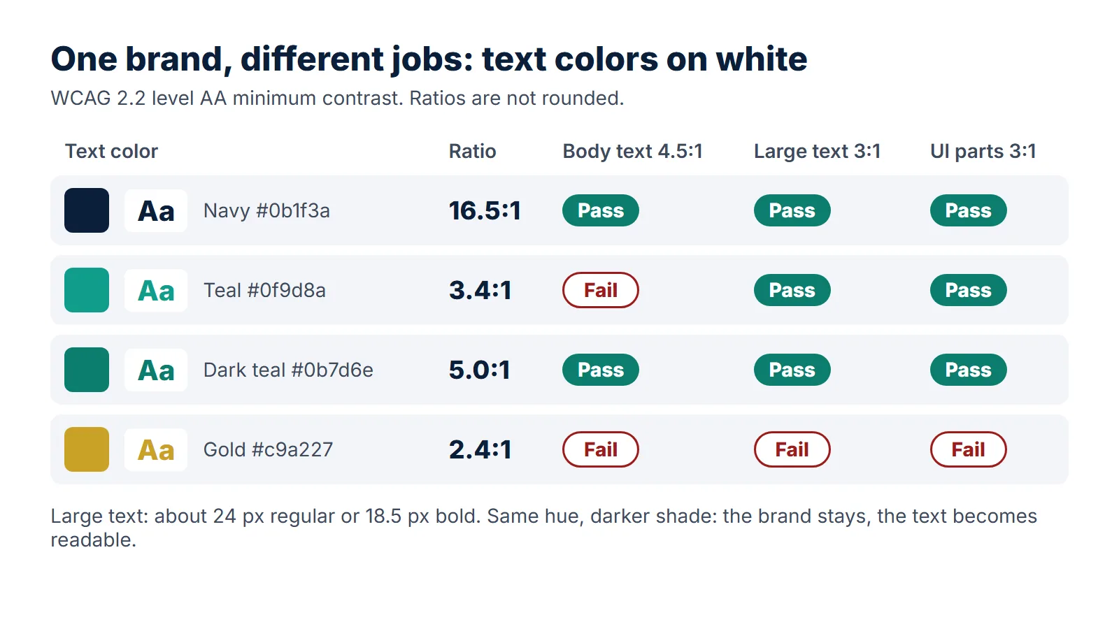
Testing is quick: browser developer tools show the ratio when you inspect text, and free online checkers accept two hex codes. Keep a table of the pairs that pass and use only those. Our website accessibility checklist covers the other WCAG 2.2 essentials, from keyboard access to form labels.
A brand color does not have to pass for body text. It has to be used only where it does pass.
Dark mode: when to offer it and how to do it properly
Phones and computers let people choose a light or dark appearance, and websites can read that choice through the CSS media feature prefers-color-scheme, which reports light or dark. A site can then switch to a dark palette automatically, with or without a manual toggle.
Does a business website need it?
For most company and service sites, dark mode is optional: visitors stay minutes, not hours. It matters more for portals, dashboards, booking systems and content sites people read for long periods. On a limited budget, a polished light theme beats a rushed dark one.
Dark mode is a second palette, not an inverted one
- Use very dark grey, not pure black. Many designers find off-white text on a grey such as #202020 easier on the eyes than pure white on black.
- Re-measure brand colors. The dark teal #0b7d6e that passes on white drops to about 3.2:1 on #202020, while the original teal #0f9d8a reaches about 4.8:1 there. The roles flip.
- Prepare a light logo. A navy logo on a transparent background disappears on a dark page.
- Let the browser know. The color-scheme property makes form controls and scrollbars match the dark theme.
The cost of dark mode is mostly testing: every page and form state is checked twice. Build both themes from the same named tokens so they never drift apart.
Typography basics: type scale, line length and line height
Typography in web design is mostly about reading comfort and hierarchy. Visitors scan first and read second, so the size, weight and spacing of text should tell them what matters before they read it.
Pick a base size, then a scale
Start with body text: 16 px is the practical minimum for Latin body text, and 17 to 18 px often reads better on phones. Then multiply by a fixed ratio for each heading level; 1.2 gives a gentle hierarchy, 1.25 or 1.333 clearer steps. Here is a 1.25 scale from 16 px, rounded:
| Level | Desktop size | Phone size | Typical use |
|---|---|---|---|
| Small | 13 px | 13 px | Captions, legal notes (never body text) |
| Body | 16 px | 16 px | Paragraphs, lists, form fields |
| H4 | 20 px | 18 px | Card titles, labels above groups |
| H3 | 25 px | 21 px | Subsections |
| H2 | 31 px | 25 px | Section titles |
| H1 | 39 to 49 px | 30 px | Page title, hero headline |
Headings shrink on phones because a 49 px headline would wrap into five lines; body text should not shrink at all. The CSS clamp() function scales headings smoothly between the two sizes. If you design for phones first, as we recommend in design for mobile first, set the phone sizes before the desktop ones.
Line length: keep paragraphs narrow
A common typographic guideline is 45 to 75 characters per line for Latin text. Full-width lines on a wide monitor make the eye lose its place on the way back; a maximum width of around 65ch on text containers fixes it. Judge Arabic line length by eye: roughly 10 to 15 words per line is reasonable.
Line height and spacing
- Body text: a line height of about 1.5 to 1.6 for Latin, 1.7 to 1.9 for Arabic.
- Headings: tighter, about 1.1 to 1.3, so a two-line title reads as one.
- Alignment: left for English, right for Arabic. Justified text leaves uneven gaps on phones.
Hierarchy is more than size
Weight, color and space carry hierarchy too. Limit yourself to two or three weights per family, since each weight is another file to download. And Arabic has no capitals, so English designs that rely on uppercase labels need another way to stand out in Arabic.
Pairing Arabic and Latin typefaces
Most Saudi business sites are bilingual, and many pages mix the two scripts in one line: a brand name, an email address, a product code. A pairing that ignores how differently they work looks unbalanced everywhere.
How Arabic type differs
The W3C's Arabic and Persian layout requirements explain the basics. Arabic letters join, and each letter can take up to four shapes depending on its position in a word, so an Arabic font contains many more glyphs than a basic Latin one. Arabic ascenders and descenders reach much further above and below the line than Latin ones. And stretching Arabic for emphasis or justification is done along the joining baseline, not by adding equal gaps between letters; pulling joined letters apart gives poor results.
In practice that means three rules for your CSS:
- Never apply letter-spacing to Arabic. A tracking value copied from the English stylesheet breaks the joins. Reset it to normal for Arabic text.
- Give Arabic more room. At the same font size, many Arabic fonts look smaller than Latin ones. A body size one or two pixels larger and a more generous line height usually balance the two.
- Do not fake italics or bold. Arabic has no italic tradition, and a browser-slanted Arabic word looks broken. Use weight or color for emphasis, and load real bold weights rather than letting the browser thicken the regular one.
Choosing the Arabic style
Naskh-style fonts follow the flowing forms people learn at school and read comfortably in long paragraphs. Kufi-style and geometric sans fonts are more angular and modern, strong in headings and interface text. A clean sans Arabic font for everything is a safe default for business sites; a Naskh body font suits content-heavy sites.
Matching the Latin partner
The easiest route is a family designed for both scripts. Several open-licensed families on Google Fonts work this way: IBM Plex Sans Arabic with IBM Plex Sans, Noto Sans Arabic or Noto Naskh Arabic with Noto Sans, and families such as Tajawal, Cairo, Almarai and Readex Pro that include Latin letters. If you pair two separate families, compare them side by side:
| Check | What to look for | Warning sign |
|---|---|---|
| Visual size | Arabic letter bodies and Latin lowercase letters look about the same height at the sizes you set | English words look shouted inside Arabic sentences |
| Weight | Regular and bold match in darkness on the page | One script looks bold next to the other at "regular" |
| Character | Both are geometric, or both are humanist and calligraphic | A rounded playful Arabic font next to a sharp corporate Latin one |
| Numerals | Digits look consistent in prices and phone numbers | Digits change style between Arabic and English pages |
Decide early which digits you use in Arabic text. Western digits (0 to 9) and Arabic-Indic digits are both read in Saudi Arabia; whatever you choose, use it consistently across prices, phone numbers and dates. For the layout side of a bilingual site, from mirroring to language switchers, see our guide to bilingual website design.
Mixed lines
Set the font stack so the browser uses your Arabic font for Arabic characters and your Latin font for Latin ones, not whatever system font it finds first. Then test real sentences: an Arabic paragraph with a brand name, an email address and a price reveals size and baseline problems in seconds.
Web font performance: fast text without layout shift
Every font weight is a file the browser must download before it can show text in that font, and Arabic fonts carry many joining forms. Load four weights of each script and the page waits on text, or jumps as fonts arrive. Google's web.dev team summarizes the techniques in its font best practices; here they are applied to a typical bilingual site.
Use WOFF2 only
WOFF2 compresses better than older formats and every current browser supports it. There is no need to ship TTF, EOT or SVG font files to visitors.
Choose font-display deliberately
swap shows fallback text at once; optional uses the web font only if it arrives almost immediately. A sensible split: swap for headings, optional for body text.
Subset by script
Remove the glyphs you never use and split files with unicode-range, so English pages do not download Arabic glyphs and the reverse. Check the font license before you subset.
Preload only what is above the fold
Preloading fetches a font early but competes with images and scripts. Preload one or two files at most.
Match the fallback font
The CSS size-adjust descriptor can scale a system fallback font to take the same space as your web font, so the text does not jump when the swap happens.
Cut weights, consider variable fonts
Regular and bold cover most business sites. If you need many weights, a single variable font file can replace several static ones.
If you use a hosted font service, add a preconnect hint for its domain. And replace icon fonts with SVG icons: an icon font is a whole file for a handful of symbols, and it shifts the layout when it loads late. Text that appears late or jumps affects how fast a site feels. We look at the business side in why website speed drives sales.
Web design colors and typography: mistakes and a pre-launch checklist
Common mistakes
Pale grey body text
Light grey looks refined in a mock-up and fails in sunlight. If body text is lighter than about #767676 on white, it is below 4.5:1.
White text on a bright brand color
White on mid teal, orange, light green or gold usually fails for button labels. Darken the button or use dark text on it.
Too many colors and fonts
Blue buttons on one page and green on another leave visitors unsure what is clickable. Four font families look unplanned and slow the page.
English settings copied to Arabic
Letter-spacing, uppercase transforms, italic emphasis and tight line height all damage Arabic text.
Designing only on a large monitor
Many visitors will see your colors and type on a phone. Approve designs on a phone, outdoors as well as indoors.
The checklist
Run through this list before launch and whenever the brand changes. It also works as a brief for a designer; our website brief template has room for these decisions.
- Every color in the palette has a named role: text, action, brand accent, surface, border, success, warning, error.
- All body text, labels and button text reach at least 4.5:1 against their background.
- Large headings reach at least 3:1, and so do input borders, meaningful icons and focus outlines.
- Text on photos has an overlay behind it; links are underlined; errors are explained in words.
- The action color is used only for things people can click or tap.
- Body text is at least 16 px, and paragraphs stay around 65 characters wide in English.
- Arabic has no letter-spacing, no fake italics and a line height of roughly 1.7 or more.
- Arabic and Latin fonts match in visual size and weight on a mixed test sentence.
- No more than two font families and two or three weights each, all in WOFF2, subset by script.
- font-display is set, one or two key fonts are preloaded, and the page does not jump when fonts load.
- If dark mode is offered, every pair has been re-measured and the logo has a light version.
- Final colors and type sizes are written down as tokens for everyone who edits the site later.
Color and type are only part of a site's design; structure, content and user journeys matter just as much. For the wider picture, start with what web design covers, and for planning screens around real users, read UX and UI in web design.
How Webnaa handles color and type on your website
Webnaa is a website design service in Saudi Arabia, based in Riyadh. Our website design service builds professional WordPress websites in Arabic, English or both, and the points in this guide are part of how we work rather than an extra:
- You see it before launch. Your design is shown on a preview link, so you can judge the colors and type on your own phone and computer, indoors and out.
- Bilingual and tested. Arabic and English pages are tested on phone and computer before launch.
- Content included. We write the content, so headings and buttons fit the layout.
- Fast and mobile-friendly. Sites load quickly and read well on phones.
- Room to adjust. On a WordPress website you can fine-tune text and images yourself from the dashboard after launch.
Prices start from SAR 39 a month, and all of the above comes in a WordPress website, for example SAR 324 a month for 5 pages in Arabic and English, with hosting, SSL and a domain in your name, no setup fee and no long contract, paid every 6 months or for a year upfront at 10% off; the price calculator prices any other size. The preview link is sent within 24 hours at most once we have all the information and content we need from you, and if you do not like the design during the design stage, a money-back guarantee applies, per the refund policy. If you already have a site whose colors and fonts are holding it back, our website redesign service is priced by written quote.
Choose what you need, see your exact price
The price updates with every choice. No surprises, no hidden fees.
The calculator is off. Press the power button to start
From Zoho, a global provider with data centres in Riyadh and Jeddah. More than 10 addresses are quoted separately.
A website that is easy to read, in both languages
See our plans, from SAR 39 a month, then send us your logo and business details.
FAQ
How many colors should a website use?
Most business sites need one brand color, one action color (often a darker shade of the brand color), three to five neutrals and three status colors. Each can have lighter and darker steps, as long as each has one clear job.
What is a good contrast ratio for text on a website?
Under WCAG 2.2 level AA, normal text needs at least 4.5:1 against its background, and large text (about 24 px regular or 18.5 px bold) needs at least 3:1. Icons, input borders and focus outlines also need 3:1. Higher is more comfortable: navy #0b1f3a on white reaches about 16.5:1.
What font size should body text be on a website?
Use at least 16 px for Latin body text, and consider 17 or 18 px for comfortable reading. Arabic usually needs one or two pixels more than Latin at the same nominal size, plus a line height of about 1.7 to 1.9.
Which fonts work well for Arabic and English websites?
Families designed for both scripts are the easiest choice, such as IBM Plex Sans Arabic with IBM Plex Sans, or Noto Sans Arabic with Noto Sans. Test a real mixed sentence at your body size before deciding.
Do I need dark mode on my business website?
Usually not. Dark mode helps most on portals and dashboards used for long sessions. If you add it, treat it as a second palette and test every page again.
Can I use my brand color for text if it fails contrast?
Not for body text. Keep the brand color for large headings, icons, shapes and backgrounds behind dark text, and use a darker shade of the same hue for links and small text. Visitors still recognize the brand, and the text stays readable.
Summary
Good color and type in web design come from a few disciplined choices: a palette in which every color has a role, contrast that meets WCAG 2.2 AA everywhere text and controls appear, a type scale with comfortable sizes and line lengths, Arabic treated as its own script rather than a copy of the English styles, and fonts loaded lightly enough that text appears fast and stays put. Make those decisions once, write them down, and test them on a phone in real light.
Sources: W3C WAI: Understanding SC 1.4.3 Contrast (Minimum), W3C WAI: Understanding SC 1.4.11 Non-text Contrast, W3C: Arabic and Persian Layout Requirements, web.dev: Best practices for fonts, MDN: prefers-color-scheme. Webnaa: website design, pricing. Contrast ratios in this article were calculated with the WCAG relative luminance formula.